

Brand guide
The marks, colors, type and language that make us POS Specialists. Everything you need to put our name on something.


We
show
up.
Overview
POS Specialists has been the local technology partner for restaurants, bars and venues since 1991. This guide is how that shows up on paper, on screen and on the side of a truck.
Who we are
We sell, install and support Genius point of sale and payments for hospitality and retail operators. We are an independent authorized reseller of Genius POS solutions, which means we represent a global platform and back it with a local team. Our technicians drive out. Our trainers stay reachable. Our phone is answered by a person, 24 hours a day, every day of the year.
That combination is the brand. The platform is world class and the people are down the road, and neither half works without the other.
How to use this guide
Two systems are in play and you need to know which one you are in.
Co-branded work. Anything that shows Genius or its product names follows the platform brand guide first. This document tells you where POS Specialists fits inside it.
Our own work. Anything that is purely POS Specialists, a truck, a shirt, a business card, a hiring post, follows this document, and that is where our red and navy mark belongs.
When the two conflict, the platform guide wins on anything carrying the Genius mark. That is the co-branding agreement, not a preference.
Questions about the brandBrand positioning
What we actually sell is not a terminal. It is the certainty that somebody competent is coming.
Brand framework
| Who we serve | Independent and multi-unit restaurant operators, bars, breweries, stadiums, venues and small retail. Owners who are on the floor, not in a corporate office. |
| What we do | Point of Sale, payments, kitchen systems, kiosks, online ordering and the AI layer on top, installed and supported by our own team. |
| The problem | Restaurant technology does not fail politely at 10am on a Tuesday. It fails during service. Most providers answer with a ticket number and a video link. |
| Our difference | One team, one phone number, a technician who drives out, and more than thirty years of having seen this exact Friday night before. |
| Proof | Since 1991. 24/7/365 answered by a person. On-site install and training. Customers who have stayed decades. |
Our slogan
We show up.
“We show up” is not what we sell. It’s what we do.
Restaurant technology does not fail politely at 10am on a Tuesday. It fails during service, on the busiest night, with a line at the register. In that moment nobody cares whose logo is on the terminal. They care whether somebody picks up, and whether somebody comes. That is the whole business, and it is the reason customers stay decades.
The mark. Use alone wherever space is tight: apparel, vehicle, signage, social.
The lockup. Use where the brand needs introducing: web, print, proposals, email.
The long form. Use where retention or long relationships are the point.
Write it flat. Keep the period; the period is the confidence. No exclamation point, no adverbs, no intensifiers. Never soften it into “we’re always there for you.” The verb is the whole point.
Why it works
Four reasons this line earns its place.
Most taglines are an ambition. This one is a description. Every customer who has had a tech in their dining room already knows it.
A platform can be world class from anywhere. Showing up cannot. That is the half we own, and this line plants a flag on it.
It is a customer promise and an internal standard at the same time. Did we show up? There is no arguing with the answer.
Three words fit on a truck, a shirt, a business card, a hold message and a homepage. Lines that need explaining do not last.
Dos and don’ts
Lead with POS Specialists. We are the brand the customer buys from.
Name Genius as the platform we represent, in the footer or the body.
Talk about people, response and presence. That is the ownable ground.
Use specifics: 1991, 24/7/365, on-site, by name.
Print “Authorized Genius dealer” or any dealer-status line as a headline.
Build a domain, handle or product name on the word Genius.
Claim to be the originator of the platform, or an “Official Genius Provider.”
Publish a customer’s street address. City and neighborhood only.
Required attribution. Any piece showing Genius carries this line: Genius is a trademark of Global Payments Inc. POS Specialists is an independent authorized reseller of Genius POS solutions. It belongs in the footer, never in a headline.
Tone of voice
We sound like a person who has done this a long time and is not selling you anything you do not need.
How we sound
Plain
Short sentences. Ordinary words. No stack of adjectives in front of a noun. If a sentence needs a comma to survive, it probably wants to be two sentences.
We do not say “solutions” when we mean a register, and we do not say “leverage” at all.
Grounded
We talk about Friday nights, card readers, new hires and 2am, because that is where our value actually lands. Abstractions are for companies with nothing specific to point at.
Every claim has a number, a year or a name behind it.
Voice in action
Lines already live and approved. Use them, and write new copy that sounds like them.
More than a POS system. It’s the people behind it.
HomepageAnyone can sell you a Point of Sale. Fewer will still be there at 2am.
Why UsLocal is not a marketing word for us.
Why UsGame day pressure-tested. Small business approved.
HomepageMy job is making sure everybody has what they need to be successful, customers and our team alike.
Alex Ugrin, PartnerPOS Specialists knows who our customers are by name.
Internal, and trueDos and don’ts
Write in sentence case. Headlines included.
Use the period as punctuation and confidence.
Say the specific thing: “a menu change at 6pm on a Saturday.”
Admit when the answer is no. It is the most persuasive thing we do.
Use em dashes or en dashes anywhere. Not in body, headlines, captions or alt text. Use a colon, a comma, or two sentences.
Stack superlatives. “Best-in-class industry-leading” is noise.
Use exclamation points in brand copy.
Write a headline nobody would say out loud.
Logo
Two colorways, one rule: the red and navy mark is who we are on our own. The white mark is who we are next to Genius.
Wordmark
The horizontal wordmark is the primary mark and the default in almost every situation. It exists in a full-color version and a knockout white version. Always use the largest available file, and never scale a small one up.
Request logo files
Red and navy on white. The standalone POS Specialists mark. Use whenever we appear on our own: vehicles, apparel, business cards, signage, hiring, local sponsorship.
White on Global Blue. The mark for anything sharing space with Genius, so the two identities sit in one color system instead of fighting.
White on navy, black or a darkened photograph. Use where a blue field is not available and the background is dark enough to hold it.
The primary mark reads correctly on Fog, Haze and Mist. Below roughly 15% gray, switch to the white version.
Which logo to use
| Truck, van, shirt | Primary. Red and navy. This is the standalone brand and the red is the point. |
| Business card, letterhead | Primary on white. |
| Website, social card | White on Global Blue, because the Genius platform is present throughout. |
| Deck or proposal with Genius in it | White on Global Blue. Set our wordmark to roughly 85% of the Genius lockup width so the two read at equal weight. |
| Over photography | White, on a darkened area of the image only. Never the color mark over a photo. |
| Favicon, avatar, app icon | The P monogram. |
P monogram
The round P mark stands in where the full wordmark cannot be read: favicons, social avatars, app icons, embroidery, anything under about 120 pixels wide. It is not a decorative element and does not replace the wordmark in layouts.

Red on white.

White knockout.
White knockout.
The floor.
The monogram is a knockout mark. It never sits on a white plate or inside a filled circle. If you have a file with a baked-in white square behind it, that file is wrong; request a replacement.
Clearspace and sizing
xThe clearspace unit, marked x, is the height of the P in the wordmark. Keep a full x clear on all four sides. Nothing enters that zone: no type, no rule, no image edge, no other logo. The grid shows the mark sitting inside its own protected cell.
37 mm
Below 140 pixels wide the wordmark stops resolving. Under that, use the P monogram, minimum 32 pixels.
How not to use logos
These twelve cover nearly every way the mark goes wrong.
Since1991
today.Color
Global Blue and white carry the system. Red is a logo color, not a layout color.
Primary palette
Every layout starts here. White keeps the work open and lets the copy lead. Global Blue is the hero, and it is the color that lets us sit beside Genius without looking like a different company.
HEX: #FFFFFFRGB: 255 255 255CMYK: 0 0 0 0PMS: n/a
HEX: #262AFFRGB: 38 42 255CMYK: 100 89 0 1PMS: 072 C
HEX: #1B1EC6RGB: 27 30 198CMYK: 96 92 0 0PMS: 2736 C
HEX: #0C0C0CRGB: 12 12 12CMYK: 50 50 50 100PMS: Black 6 C
Deep Blue is never a typography color. It sits close to Global Blue on purpose and is not a second brand blue. It exists for depth, buttons and the arrow on a call to action. Black is a typography color and never a background.
Signature red
Red and navy are the colors of our mark, and they are the only thing in this system that is ours alone. That is exactly why they are protected rather than spread around. They live inside the logo and in a narrow set of standalone applications. They do not become headline colors, background fields, button fills or chart colors.
HEX: #B4121CRGB: 180 18 28CMYK: 12 100 96 3PMS: 1795 C
HEX: #0F2256RGB: 15 34 86CMYK: 100 88 34 25PMS: 282 C
| Use red for | The logo. Vehicle and apparel graphics. Business cards and letterhead. Local sponsorship and community work. Anything where POS Specialists stands entirely alone. |
| Never use red for | Headlines or body type. Backgrounds or panels. Buttons or links. Anything appearing alongside a Genius mark, where Raspberry is the sanctioned red. |
Accent palette
The accents are where the brand gets its warmth. Use them at roughly 5 to 15 percent of a layout, as rules, chips, icon fills and small shapes. Pulse Blue ties the group back to Global Blue, so include it whenever more than one accent appears. Never as a background field, never as type.
HEX: #1CABFFRGB: 28 171 255CMYK: 67 2 0 0PMS: 298 C
HEX: #FFCC00RGB: 255 204 0CMYK: 0 14 100 0PMS: 116 C
HEX: #FDA052RGB: 253 160 82CMYK: 0 50 71 0PMS: 2025 C
HEX: #F4364CRGB: 244 54 76CMYK: 0 94 64 0PMS: 192 C
HEX: #87179DRGB: 135 23 157CMYK: 59 99 0 0PMS: 2593 C
Raspberry means something negative. Errors, warnings, the word “Don’t.” It is not a decorative red and it is not a substitute for POS Red.
Neutral palette
HEX: #595959RGB: 89 89 89CMYK: 0 0 0 78PMS: Cool Gray 10 C
HEX: #C4C4C4RGB: 196 196 196CMYK: 0 0 0 27PMS: Cool Gray 5 C
HEX: #EEEEEERGB: 238 238 238CMYK: 0 0 0 8PMS: Cool Gray 1 C
HEX: #F4F4F4RGB: 244 244 244CMYK: 0 0 0 5
HEX: #F8F8F8RGB: 248 248 248CMYK: 0 0 0 3
Using color
At least half of any layout is white space or Global Blue. Everything else supports. These four ratios cover nearly everything we make.
Anyone can sell you a Point of Sale.
Fewer will still be there at 2am. Our technicians drive out, our trainers stay reachable, and the phone is answered by a person.
The default for web pages, documents and anything text-heavy. Blue does the headline and one element.
We show up.
Your local technology partner since 1991.
Social cards, covers, dividers and anything that needs to read as brand first. Accents appear only as small rules or chips.
Support
One team, one phone number.
Not a call center. Not a franchise.
Data, tables, long documents and interface work, where color needs to stay out of the way.
The standalone ratio. Red arrives through the mark and nothing else. Vehicles, apparel, cards, community work.
The one place red appears, and even here it is carried by the logo rather than a colored panel. Red is never the field.
How not to use color
Typography
One typeface, two weights doing almost all the work: Black for headlines, Light for everything that explains.
Our typeface
GP Commerce is the brand typeface, matching the Genius platform we represent. Thin and Air weights are not approved. Where GP Commerce cannot be installed, the sanctioned substitutes are DM Sans on the web, Aptos in Microsoft Office, and Noto Sans for non-Latin characters. This page is set in DM Sans.
Request font filesSpecimen set in DM Sans
GP Commerce
Aa
Black (900) for headlines and labels. Light (300) for lead paragraphs, subheads and eyebrows. Regular (400) for standard body copy. Medium and Bold are for interface work only. The specimen above is DM Sans, the sanctioned web substitute, because GP Commerce is licensed and cannot be embedded in a shared file.
Headlines and subheads are sentence case. Only proper nouns capitalize. Title Case Everywhere reads like a press release from 2004.
No centered paragraphs, no justified text. Line spacing at roughly 150% for body. Default tracking. Never mix typefaces or weights inside one block.
Hierarchy
The scale below is what this page uses and what any POS Specialists web page or document should use. Sizes are for web; scale proportionally for print.
Headline
Section heading
Subhead
Lead paragraph, used once at the top of a section to set up what follows.
Body copy. The workhorse. Sixteen over twenty-four, left aligned, a measure of roughly 65 to 75 characters so the eye can find the start of the next line.
Eyebrow label
How not to use type
Your local technology partner
Photography
Real rooms, real service, real people. If it looks like it came from a stock library, it works against everything the brand claims.
What we shoot
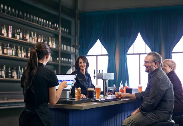

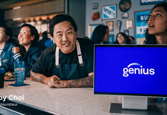
Real rooms in the light they actually have. Mixed crops, never a uniform grid, always the 36 pixel radius.
Operators at work
Owners and staff mid-service: taking an order, working a line, running a bar. Hands on equipment. Motion is welcome, and so is a little mess. A kitchen that looks staged looks like a lie to anyone who has worked in one.
The rooms themselves
Dining rooms, counters, patios, concourses. Shot as they actually look at service, in the light they actually have.
Our people on site
Technicians and trainers in a customer’s building, because that is the proof of the whole promise. This is the most valuable image category we have. Shoot it whenever the chance comes up.
Equipment in context
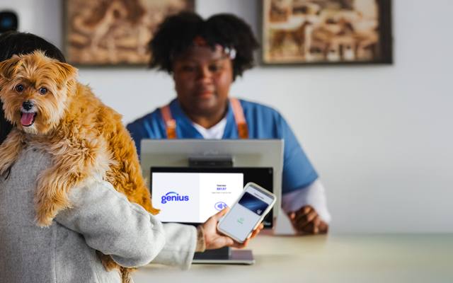
Genius hardware where it lives, on a counter with a receipt roll and a coffee ring next to it. Never a device floating on white unless it is a spec sheet.
Treatment. Natural color, no heavy filters, no duotones. Crop to a 36 pixel radius in layouts. When type sits over an image, darken the image and set the type in white. Never colored type over a photograph.
How not to use photography
 We show up.We show up.1600 Main Street
Graphic elements
A small kit. Three accent rules, one corner radius, one button. That is most of it.
The accent rules
Three short rounded rules in Pulse Blue, Sunshine and Creamsicle, in that order. They sit beneath an eyebrow label and act as our masthead device across social cards, deck dividers and section openers. It is the one piece of decoration in the system, and it works because it is the only one.
Customer story
Welcome to the family.
Rules are 46 by 8 pixels at a 4 pixel radius, 12 pixels apart, always in the same color order. Do not add a fourth, reorder them, or use them as a divider elsewhere on the page.
Shapes and cards
Every card, swatch, image crop and panel. This single value does more to make work look like ours than anything else here.
Fully rounded, Deep Blue on white, white type. Used for chips, tags and jump links. Never for a primary button.
Black label with a Deep Blue circle. On hover the circle fills the whole label. This is the primary call to action everywhere.
Nothing else. No drop shadows beyond the single soft token, no outlines, no icon sets outside the Genius library, no gradients as backgrounds, no patterns, no textures. The restraint is the design.
Questions
If something is not covered here, ask before you improvise.
Logo files, fonts, templates and anything you are unsure about.
Email genius@posspecialists.comUsing our mark in an article, a listing or a partner directory? Use the primary red and navy wordmark on white, keep the clearspace, and do not alter the colors.
Contact usPOS Specialists brand guide, version 1.0, August 2026. Genius is a trademark of Global Payments Inc. POS Specialists is an independent authorized reseller of Genius POS solutions.